Some notes at the end of August 2020.
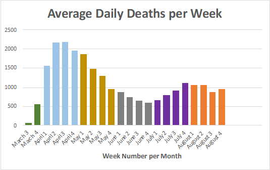
The attached chart shows the deaths in the US since the middle of March from COVID-19.
In this case I have charted the average daily deaths per week since then to be able to compare month to month changes. I believe that this is more revealing than total monthly rates.
As you can see, the deaths in this country peaked in mid-April and then began to decline as the country self-quarantined and shut down potential places of incubation and transmission.
These results led to a nationwide rush to reopen at the end of May, and we can see that, as predicted, 4 weeks later we have begun to see the resultant effects of those actions on death rates, which began to increase in early July and is accelerating now.
For the month of August, after many of the most affected states imposed new restrictions and mandated masks we have seen a leveling off of deaths.
Once again, deaths are a statistic independent of testing or cases recorded. It would be expected to lag about 4-5 weeks behind outbreaks.
I will continue to follow the data and report it at the end of each month.