I have made this point in the past. Today the data I want to share with you makes the point crystal clear.
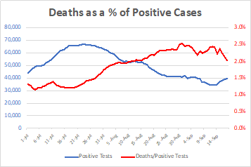
There is only one graph attached here. In this analysis I have compared the number of deaths recorded per day since July 1 with the Positivity Rates of tests performed that day.
Let me explain why I used these data points and what they mean.
The Blue line in the graph shows the number of positive cases identified as a rolling 7-day average for each day. As you see, the number of identified positive cases has been dropping since mid-July. This data, taken alone would seem to indicate that we have indeed “turned the corner” with respect to the virus since we can see cases decreasing.
The Red line in the graph displays how many deaths have occurred as a percent of positive cases detected.
Clearly, these two lines do not parallel each other; in fact, they cross each other in early August. What are the reasons that these lines cross? What things could create this result? Let’s look at what factors would result in this.
DECREASING CASES SHOULD HAVE RESULTED IN DECREASING DEATHS
If the number of cases was, in reality decreasing, and if the ability of doctors to treat the disease and prevent death has NOT changed since July 1, then we would expect that the death rates with respect to positive cases would follow the same line. Think of it this way, if the death rate was 1%, then for each 1,000 positive cases detected, ten people would be expected to die. If the number of positive cases decreased to 800, we would then expect only 8 people to die. 600 positive cases would result in 6 deaths, and so on. In this way the rate of Death as a % of Positive Cases would remain constant at 1%. The two lines, Red and Blue would be parallel.
LETHALITY SHOULD HAVE REMAINED CONSTANT OR DECREASED
Likewise, what would we expect if the lethality of the virus were to decrease over time? Let’s assume that the number of positive cases identified stayed constant over the period at 1,000, but that the lethality decreased. At a lethality of 1% we would expect to see 10 deaths; as the lethality decreased to 0.9%, we would then see only 9 deaths per day; at 0.8% we would see 8 deaths, at 0.7% we would see 7 deaths, and so on. In this case we would see a decreasing Red line with respect to a constant Blue line.
Similarly, if the lethality were to increase, we would see an increasing Blue line with respect to the Red line.
What do we actually see? The death rate when compared to the positivity rate IS INCREASING with respect to the rate of positive cases detected.
IS LETHALITY ACTUALLY INCREASING?
There are only two potential explanations for this.
The first explanation is that the lethality of the virus is, in fact increasing, from a minimum of around 1.2% to a maximum of around 2.5% over the period observed. I believe that the possibility that the virus lethality has doubled over the past 3 months to be highly unlikely.
A separate way of looking at this would be to suggest that the ability of the healthcare system to treat patients and prevent deaths has decreased by 50% over the same period, that twice as many people entering hospitals are dying now as opposed to early July. I believe this possibility is equally unlikely. Quite the contrary, we can be much safer in assuming that the number of patients surviving this disease has been increasing with better hospital protocols, the use of Remdesivir, dexamethasone high pressure oxygen and other therapeutics.
The second explanation is that we have been undercounting the positive cases on a daily basis since the beginning of July. With a constant lethality rate, the two lines would have been parallel. Or, with a decreasing lethality the Red line would have been decreasing with respect to the Blue line.
The inescapable conclusion is that because we have been doing less testing, and that as a result we have been identifying fewer positive cases, we are seeing a data artifact which suggests that lethality has been increasing.
You might ask, “how many tests SHOULD have been done in order to be more accurate?”
This can actually be calculated.
In order to “force” the Red and Blue lines to run in parallel, the number of positive cases identified would need to have increased to between 65,000 and 80,000 per day (an increase of an average of 42%). These numbers would have allowed the death rates as a percentage of positive cases identified to be proportionate to the positive cases identified, as one should expect them to be.
And in order to reach those numbers of positive cases, we would need to be testing closer to 1,000,000 tests per day. The fact that we are only testing a little less than 700,000 tests per day has specifically led to the results seen here.
Lower testing has falsely underestimated positive cases.
Underestimated positive cases has falsely indicated increasing lethality.