Before I begin, I want to emphasize that I am not writing this with any political intensions. This is not an essay with any focus on whether Democrats or Republicans have handled the COVID-19 pandemic better or worse based on their politics. However, it is undeniable that Red States have had DIFFERENT approaches to issues of reopening, mask mandates, social distance enforcing, etc. The results from these approaches have had distinctive impact on the results seen, and those can be documented in the data. This analysis is designed to evaluate the policy differences and how they have affected the disease data. Understanding the consequences from policy choices should inform are actions going forward.
There are several graphs attached here based on the data that I have been following for months and it has informed my opinions in previous essays. This analysis is a bit more complicated, so let’s dig in.
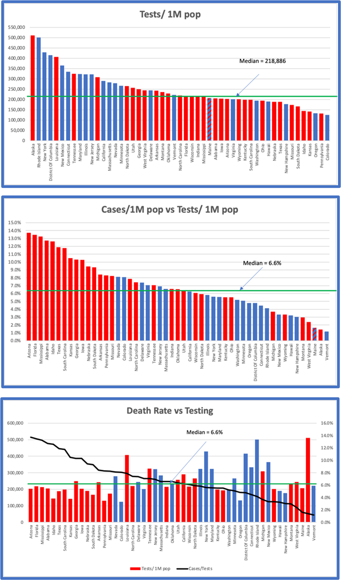
The results shown here are from cumulative data as of September 1.
The first graph shows a plot of testing rates (not gross numbers but tests per million population). It is clear from this plot that Blue States have been, on average testing a greater percentage of their populations than Red States. If you look at the Median rate of testing of about 220,000 tests per million of population, Blue States are far more likely to be above average than Red States.
The second graph shows a plot of the Positive Cases detected as a function of the Tests performed. In this case the results are quite different. Red States comp the majority of states with above average results. In other words, although Blue States are testing more people, Red States are detecting more cases as a percentage of the tests they perform.
Why is there such a difference? It is important to understand this difference to assess the impacts of policies in those states.
There are 2 possible reasons for the results seen in these two graphs. When Cases as a percent of Tests is higher in one state over another there are two possibilities.
- The first possibility is that there are, actually more people infected in that state as a percentage of the population. More infected people would mean that you would identify more cases when you do the same number of tests.
- The second possibility is that in those states that have a higher testing rate, they are testing a wider population, including more asymptomatic, or potentially negative people than the other state which may be restricting its testing to people showing symptoms or presenting at hospitals. This would result in an effective lower case-rate since the same number of tests would find more negative results in those States that have a wider net.
In the first case, we must conclude that the actions of the Red States resulted in higher infection rates in their states, which in turn resulted in higher Cases/Tests.
In the second case, we must conclude that testing in Red States has been more restricted than in Blue States and that even though the case rates are identical, Blue States would show lower identification rates.
If the President’s request to lower testing was followed more closely by Red States than Blue States, we would expect to see higher case rates in those states than in others.
There is a way to sort out these two possibilities, and that is to look at the Death Rates.
The third graph shows the Death Rate per state. Perhaps surprisingly this graph, which is sorted strictly by the death rate, parallels the Cases/Tests rates of the graph directly above. The same distribution of Red States vs Blue States is seen. The two charts with respect to Red vs Blue are effectively identical.
What could explain this?
The simple answer is that where there are more cases detected there are more deaths recorded. But this is a superficial understanding of the data. We know that deaths are a reasonably reliable data source, recorded locally, state-wise and nationally, while cases and testing are less well documented, but that they are totally correlated to each other.
Above we asked the question “why are Red States seeing a higher level of cases per tests than Blue States?” This graph gives us some insight. If there was a higher level of infection in Red States that in Blue States, we would expect that the death rates in those states would be significantly higher than in Blue States. The more infections present, with a constant state-by-state lethality rate would mean that we would expect higher death rates in states with higher infections.
Here is a simple example. Let’s look at a group of 1,000 people in each of two states.
If in the first state there were 100 people infected, we would expect to see around 6 deaths.
If in the second state there were 200 people infected, we would expect to see around 12 deaths.
Now think about testing in those two states. If you test 200 people in each state, you would see a death rate of 6/200 (3%) in the first state and 12/200 (6%) in the second state. You would need to test 200 people in the first state and 400 people in the second state to get equal rates of death: 6/200 = 3% and 12/400 = 3%.
The facts are that even with higher testing rates in Blue States, and with higher case rates in Red States, the correlation between death rates and political affiliation of the states is unaffected.
What does this mean?
We see that when states have higher numbers of identified cases as a function of tests, they also have a higher rate of deaths per test, and that this relationship correlates virtually 100% with those same states’ distribution between Red and Blue.
The fact that death rates, which can be well assumed to be constant nationally, correlates with the increased fraction of cases identified as a percent of test performed, can only be explained by the fact that Red States are doing less testing while having higher infection rates.
I am left with the conclusion from this data that those states that forced reopening prematurely, that resisted mask mandates and that encouraged large social gatherings have increased their infection rates and their deaths. The concomitant decrease in testing in these states has clouded the public awareness by SUGGESTING that case rates are decreasing in these states. Those case rates have NOT decreased; only the identification of cases as controlled by testing frequencies has created a misleading statistic.