
I have been following the data associated with testing, cases, hospitalizations, ICU admittance and deaths. There are problems associated with each of these data sources, but I believe there is still significant value to be gleaned from looking at the historical data.
PART 1 – TESTING HAS, IN FACT DECREASED
Mr. Trump, June 20:
“When you do testing to that extent, you’re going to find more people, you’re going to find more cases. So, I said to my people, ‘Slow the testing down, please!’”
What has happened?
Here is the data:
The current administration has been showing graphs showing a decrease in cases nationwide. But are those claims valid?
It is critical to look not only at the number of cases, but to compare it to the number of tests performed.
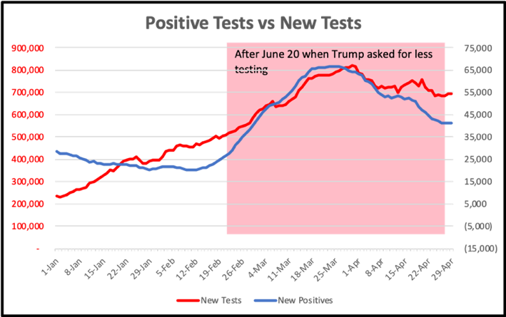
In less than a month after the President’s statement, the numbers of daily testing began to decrease, and has continued to decrease through today. At the same time, the number of determined positive infections also decreased; but the interesting result is that this decrease is generally proportional to the number of tests performed.
What can we learn from the data?
As the President has said, if you do more tests you will indeed find more positive cases. Those positive cases already exist in the field like butterflies flit between flowers. The larger your net, the more butterflies you will snag. The larger net does not create new butterflies, it just allows you to catch more.
Let’s now look the % of positive cases detected as a proportion of the tests taken on that date. You can see that before June 20 the number of positive tests detected by testing had been decreasing. What that means is that the number of tests performed on people who were negative was greater during May. This is to have been expected. When testing began to expand in the spring, more people who were concerned that they may have been exposed requested testing. At this point we began to restrict the testing to those people who had symptoms or had demonstrated risk based on their immediate contacts or from where they had been. Restrictions on who gets tested absolutely skews the results towards positive.
The important takeaway from this graph is that after June 20 the percentage of positives within the US tested population has remained CONSTANT. What this means is that we have continued to restrict our testing to a specific subgroup of the population. Had we expanded our testing to larger segments of the population who were less likely to have been infected, we would have seen a continual decrease in positive percentages.
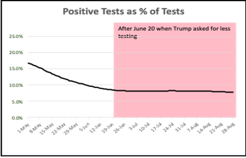
We can conclude that we HAVE NOT increased prospective screenings of populations, even with the publicized increases in screening at colleges, and we HAVE ONLY continued the same type of testing that we have been doing since the beginning of May. The increased screening done in places like colleges have had a negligible impact on the millions of tests being done nationally.
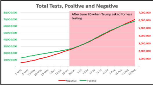
These conclusions are confirmed when you compare the negative testing results to the positive testing results, as seen in this graph.
If you expand testing to begin to include more asymptomatic people with the purpose of attempting to determine how the infection is spreading in the general population, you would expect to see a larger and larger fraction of negative results compared to positives; however, this is not what we see. Rather, the negative and positive results continue to parallel each other. This suggests that we continue to restrict our testing protocols to the same constellation of symptoms as we have done in the past.
The conclusions from these three data sets since June 20 when Mr. Trump told the government to reduce testing are:
- The government HAS indeed begun to decrease the amount of testing done.
- This has resulted in an “apparent” decrease in cases, not because the virus has stopped spreading, but because we are no longer increasing our ability to track the infections.
- Testing protocols HAVE NOT expanded past the restricted subpopulations that were tested over the past 3 months.
PART 2 – HOSPITALIZATION DATA
Before discussing the data, there are several observations that should be made with which we can have confidence.
Reports on medical protocols for inpatient cases over the past several months have shown a significant reduction in death rates.
The use of Remdesivir, steroids like dexamethasone, modified protocols for intubation and the use of ventilators, increased understanding of the use of oxygen, etc., have resulted in reported decreases in lethality rates for the disease.
Where US mortality rates in May were reported at 6%, it is now tracked at around 3%.
Age Demographics have shifted
It is important to recognize that since early June when many of the states opened up bars, restaurants and other public facilities, the average age of individuals hospitalized has decreased.
|
|
Age |
||
|
|
18-47 |
over 65 |
|
|
May |
26% |
47% |
|
|
August |
34% |
37% |
|
CONCLUSIONS:
- The enhanced medical protocols are reducing lethality.
- Since we know that COVID-19 mortality is related to age, the change in age distribution of hospitalized patients is also reducing observed lethality in hospital settings.
Although there are many factors influencing these numbers including who is admitted, what data is reported, etc., it is safe to assume that if you get COVID-19 today, the chances of you surviving are greater than they were 3 months ago and are getting better every day.
What these observations imply is that if we were to see a steady, unchanged level of hospitalizations, we would see a decreasing number of deaths as the lethality rates would be suppressed by improved medical protocols and changing hospitalization age distributions.
COVID-19 hospitalizations are not consistently reported.
Some states report current hospitalizations, while others report cumulative hospitalizations. Some only report the percent of total COVID-19 cases that are hospitalized. Yet others don’t report at all.
Only 23 states have been reporting consistent data, although as many as 36 have recently begun to report their data. There have also been numerous articles published documenting States restricting healthcare organizations from reporting their data or attempting to influence those organization’s data classification prior to reporting.
With these observations we can now look at the actual data to see if it is internally consistent.
IS THERE EVIDENCE OF HOSPITALIZATION UNDERREPORTING?
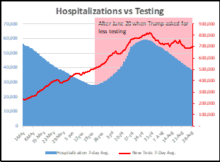
This graph shows hospitalizations as a function of testing.
As testing has decreased, so has hospitalizations. This result MAY be true, but it is hard to justify. As we have done less testing, we expect to record fewer positive cases. As I have pointed out before, the number of cases does not decline when you test less, only the number that you can identify. Therefore, it is difficult to conclude that decreased testing has resulted in decreased hospitalizations.
Saying it another way: If the percentage of patients infected as reflected in testing stays constant (and that is what the data shows), then the number of infected patients nationwide has not decreased. And if hospitalizations stay proportional to those infected, we should not be seeing a decrease in hospitalizations. Unfortunately, the best conclusion that can be drawn is that the hospitalization reporting is, in fact, problematic and is being manipulated to agree with the testing-reported positive case rates.
In this graph we see that the death rates have NOT decreased proportionately to the reported rate of hospitalization.
If our healthcare professionals are reducing the mortality of the disease, and if the age distribution would also be reducing the mortality numbers, we would expect that the deaths reported today would be lower than they would have been for an equal number of hospitalized patients 3 months ago and would be continually improving.
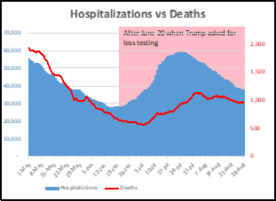
That prediction is NOT borne out by this graph. Rather than seeing the death rates dropping FASTER than the decrease in hospitalizations, we see that the death rates are remaining relatively constant, with only a small potential decrease in the past month. These results are inconsistent with the hospitalization data suggesting that the hospitalization rates are significantly underreported.
The only other possible conclusion is that there has actually been NO increased success of treatment protocols and there is NO increased level of survival for younger patients. As these caveats have been rejected by virtually all observers, we must reject this conclusion.
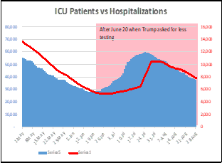
LOOKING AT ICU ADMISSIONS
These observations are paralleled if you look at the data for ICU admissions. The reporting on ICU admissions would be expected to be equivalent to the reported hospitalization data as the two pieces of data are reported simultaneously.
We see that this is true.
In this graph you can see that ICU admissions absolutely parallels the hospitalization data.
We can now examine if the ICU data has the same problems when looking at deaths as you see with hospitalizations. This is shown in this graph. We see that ICU admissions directly equate to the rates of deaths. Since we know that this can’t be true based on the decreasing lethality, we must conclude that ICU admission data is underreported.
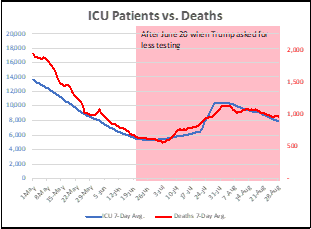
I have argued repeatedly that DEATHS are the only valuable measure of the current status of disease in this country. This data is very hard to manipulate as death certificates are well reported, well verified and exist in local, state and national data bases.
We can see from the data shown here that the Testing, Cases, Hospitalization and ICU data is most likely inaccurate, and therefore, everyone should be extremely cautious when using that data alone to make conclusions.
When you see a talking head report on changes in reported cases, for example, that there is “good news, that cases are decreasing”, please keep this in mind. The data displayed may show decreased cases uncovered because of decreased testing, the data shown may show decreased hospitalizations, but because that data is unreliable, and perhaps manipulated for political reasons, it is suspect.