I had reported, at the end of September, that there were some encouraging signs. Unfortunately, once again this country has squandered those positive trends and we are back on a discouraging track.
I have reported on two pieces of data; positivity rates and deaths per week. I will update both of those here.
I mentioned the other day that I would speak a little bit about the increased cases being identified over the past weeks. I have said often that in this case Mr. Trump is correct. The more testing you do, the more cases you will find. Where he is totally wrong is to draw some sort of conclusion that the only reason that we think the virus is spreading is because we are doing more tests and uncovering more infections.
Here is my analogy. Let’s say you fish for shrimp. You sail out to a spot in the ocean and cast your net. Let’s say that your net can cover 100 cubic feet of water. You pull in the net and you find that you have captured 100 shrimp. That means that, in that spot in the ocean the shrimp were present at about 1 shrimp per cubic foot.
If you increase your net size so that it covers 200 cubic feet of water, you can expect that you will bring in 200 shrimp. That does not mean that there are suddenly more shrimp in the water, just that with the same shrimp density of 1 per cubic foot, you can now capture 200 shrimp.
Now, you sail over to a different spot in the ocean, and you cast in your 100 cubic foot net. You bring it in and now you have captured 200 shrimp. What does that mean? It means that the shrimp at that new spot are present at a rate of 2 shrimp per cubic foot. With the same size net, you now capture twice as much shrimp.
So, the way to determine whether shrimp are more or less plentiful in an area, is that you look at how many shrimps can be captured with a similar sized net.
This is the same thing with COVID-19 testing. The more you test, the more cases you will “capture”. The only valuable metric to look at is what is the density of infections captured using the same size testing net. This metric is called “positivity” and simply measures how many positive tests are hauled into the boat as a function of the size of the testing “net” cast into the population.
POSITIVITY RATES
Here is the data:
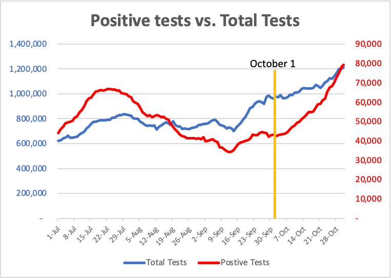
There are 2 graphs here. The first graph is the same data as shown in September. Whereas in September we had begun to see a decrease in the number of positive cases even while total testing increased, resulting in an increasing gap between the two lines, that trend has reversed in October. Now, the positive tests have been increasing at a far greater rate than the increases in testing.
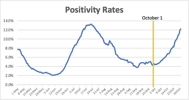
The second graph shows the positivity rates for tests performed. Positivity, as described above, is the percentage of positive tests captured as a function of the total number of tests performed.
Positivity rates had been dropping in this country due specifically to the observations of care taken by the American public in the spring. However, the combination of overly aggressive economic opening combined with Memorial Day activities reversed this trend and caused a dramatic increase in Positivity rates. New restrictions and better controls reversed this trend in late July, through September. However, beginning in October we have begun to see a new and troubling increase in positivity rates.
DEATHS
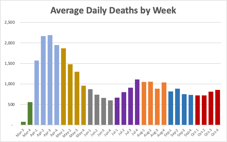
The final graph shows the average daily deaths per week. Once again, while we had seen a decrease in the rates of death during the month of September, that trend has reversed in October. We now are seeing a weekly increase in deaths. This is extremely troubling as we are only beginning to enter the period in which we expect to see a constellation of factors that all point towards a greater potential to increase infections, hospitalizations and deaths.